
Vibe Coding course · lesson 17 of 26
- 1What Is Vibe Coding? A Beginner's Guide
- 2The Vibe Coder Mindset: Build Small, Check Often
- 3Choosing Your Vibe Coding Tool: A Beginner's Guide
- 4Set Up Your Workspace for Vibe Coding
- 5Your First Vibe-Coded App in 30 Minutes
- 6From Idea to MVP: Plan a Small First Version
- 7Spec-Driven Development: Give AI a Clear Plan to Build From
- 8Mockups and Examples as Input: Show AI What You Mean
- 9Choose a Tech Stack: Pick Tools You Can Keep Using
- 10Prompts That Build Things: Give AI a Clear Task
- 11Context Documents: Give AI Lasting Project Instructions
- 12Managing Context and Sessions: Keep AI on the Right Task
- 13Set Standards Early and Review AI Output
- 14Build the Skeleton: Start the BookmarkBox App
- 15Add Data and a Database: Save Real Bookmarks
- 16Add Accounts Safely: Sign In and Protect Each User's Data
- 17Design and Polish: Improve the App One Pass at a Time
- 18Version Control with AI: Keep a Safe History of Your Work
- 19Debugging with AI: Find the Cause Before You Fix It
- 20Test by Default: Make Sure Each Feature Keeps Working
- 21Refactor and Keep Your Code Healthy
- 22Security for Vibe Coders: Protect Your App and Its Users
- 23Deploy Your App: Put BookmarkBox Online
- 24Monitor and Maintain Your App After Launch
- 25Where Vibe Coding Stops: Know When to Change Your Approach
- 26Capstone: Ship a Project from Idea to Production
After this lesson, you will be able to make a focused visual improvement using a screenshot, check how the app works at narrow and wide widths, and review a few accessibility basics. Polish should make the app clearer and easier to use. It does not mean adjusting tiny details forever.
In Add accounts safely, you connected BookmarkBox to user accounts. Now we will improve how its screens look and feel in the normal, empty and error states.
Start from something you can see
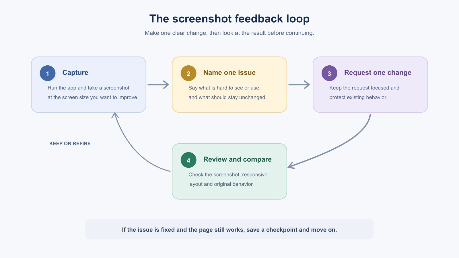
Run the app and capture the screen you want to improve. A screenshot gives the AI and you a shared reference to the actual result, rather than asking from memory. If your tool supports image input, attach the screenshot. Otherwise, describe the visible problem and point to the relevant page or component.
Be specific about what feels wrong. “Make it look better” invites a redesign with many guesses. “The Save button is hard to find because it looks like the other links” points to one issue. Say what should remain unchanged, such as the content, colors or page structure. Make one or two related adjustments, then check the new result before asking for another pass.
For example:
1Use the attached screenshot of the BookmarkBox saved-links page.
2
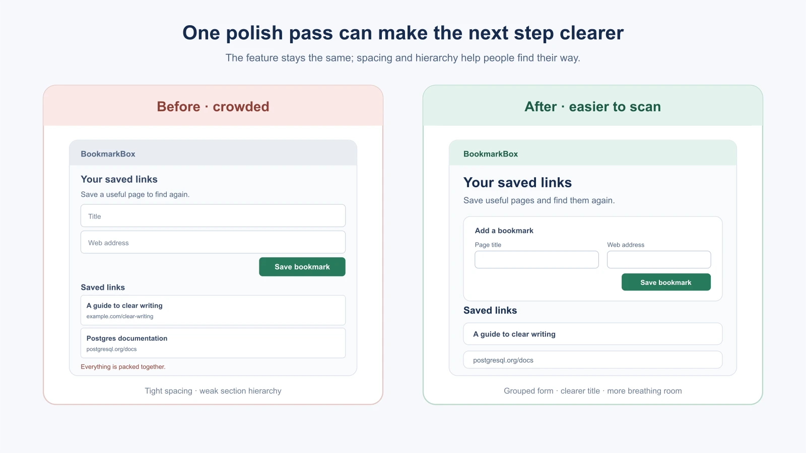
3The main issue is that the page title, form and saved list run together. Improve the spacing and heading hierarchy so each section is easier to scan. Keep the existing colors, text and behavior. Do not add a sidebar or new features.
4
5Make only this visual change. Tell me which files you will edit, then show me how to review the result at desktop and phone widths.
This follows the same principle as Mockups and examples as input: explain what the image shows and which details matter.
Check layout, spacing and type
Responsive layout means the page adjusts to different screen sizes. Check the app in a wide browser window and a narrow phone-sized window. Look for clipped buttons, text running off screen, controls that are too cramped and content that becomes hard to follow. A page should keep its purpose when the available width changes.
Use spacing to show which parts belong together. A small gap within a form and a larger gap before the saved list can make the page easier to scan. Use a clear text hierarchy: one main page heading, section headings and readable body text. If every label is large or every item has the same visual weight, it is harder to tell where to look first.
Ask the AI to make a limited change and explain the styling it used. If the project already has design tokens or Tailwind conventions, point it to them. Reuse the established scale instead of inventing unrelated spacing and color values on every screen.
Design every important state
A polished page is more than its happy path. Check what a person sees when:
- The list is empty: Explain what belongs here and how to add the first bookmark.
- A form has an error: Say what needs to be fixed near the relevant field; do not rely only on a red border.
- The app is loading: Give a clear sign that the app is working, if loading takes long enough to notice.
- The list has content: Make each bookmark's title and action easy to identify.
These states help people understand what the app is doing and what they can do next. Keep the words direct and useful. “No bookmarks yet. Add a link above to get started” tells a person more than “Nothing here.”
Include a few accessibility checks
Accessibility means making an app usable by people with different abilities and ways of interacting with devices. You do not need to become an accessibility expert to catch common issues, but an AI-generated page still needs careful review.
- Use a real heading structure and a visible label for every input. The W3C's forms tutorial recommends associating labels with their controls so people can identify fields, including when using assistive technology. (W3C form labels).
- Try using the page with only a keyboard. You should be able to reach controls in a sensible order, activate them and see which one has focus.
- Do not communicate an error only with color. Include text that explains the issue.
- Check that text is readable against its background. WCAG 2.2 AA sets a contrast ratio of 4.5:1 for normal text and 3:1 for large text. These are useful checks, but passing one contrast check does not make the whole page accessible. (W3C contrast guidance).
- Try zooming or narrowing the viewport. The W3C guidance for reflow describes content fitting a 320 CSS pixel wide viewport without losing information or functionality, except for content that needs two-dimensional layout. (W3C reflow guidance).
Ask the AI to review one specific screen against these checks, then verify the visible behavior yourself. Automated tools can help find some problems, but they cannot decide whether the instructions make sense to a person.
Know when to stop polishing
Use a short stopping list before you ask for another visual change:
- The main task is easy to find and complete.
- The page works at narrow and wide widths.
- Empty and error states explain what is happening.
- Text, labels, focus and contrast are understandable.
- The current change did not break a behavior that already worked.
If the list is satisfied, save a checkpoint and move on. A more decorative shadow or a slightly different shade can wait unless it solves a real problem. In Version control with AI, you will learn how to use Git checkpoints while building.
Simple rules for spacing and type
You do not need a design background to make a page look tidy. A few habits go a long way:
- Use a small set of text sizes. For example, one size for the page title, one for section headings and one for body text. Too many sizes make a page feel messy.
- Use consistent spacing. Pick a few gaps, such as small, medium and large, and reuse them. Many designers build spacing from a base unit like 4 or 8 pixels, so values stay related.
- Group related things. Put less space between a label and its field than between two separate sections.
- Limit line length. Long lines of text are harder to read. A comfortable reading width helps on wide screens.
- Use one accent color for the main action, so people can find it.
If your project already uses Tailwind CSS classes or design tokens, ask the AI to reuse them. “Use the existing spacing and color classes in this project” keeps the result consistent with the rest of the app.
Make it easy to tap
On a phone, controls need to be big enough to hit. The W3C's WCAG 2.2 includes a Target Size (Minimum) criterion at level AA that asks for pointer targets of at least 24 by 24 CSS pixels, with some exceptions, such as targets with enough space around them. Treat that as a lower bound, not a goal. Buttons and links that are comfortably larger are easier for everyone to use. (W3C target size guidance).
Look at the Save and Delete controls on a narrow screen. Are they close together? Could a person tap the wrong one? Moving a destructive action away from the main action is a simple way to prevent mistakes.
A polish pass in three small steps
Instead of one large request, try three short passes. After each one, look at the result and save a checkpoint if it is better.
- Hierarchy. “Make the page title, section headings and body text clearly different in size and weight. Change nothing else.”
- Spacing. “Group the form fields together and add more space between the form and the saved list. Keep the existing colors and text.”
- States. “Improve the empty state and the error message for the form. Keep the layout the same.”
Each pass has one purpose, so you can see what it changed and undo it if it does not help.
A quick keyboard check
You can test basic keyboard use in a minute, with no special tools:
- Click in the page, then press
Tabrepeatedly. Focus should move through the controls in a sensible order. - At each stop, look for a visible outline or highlight. If you cannot tell where focus is, add a clear focus style.
- Press
ShiftandTabto go backward. - Activate a button with
EnterorSpace, and a link withEnter. - Try to complete the main task, adding a bookmark, using only the keyboard.
If a step fails, describe exactly which control and which key, and ask the AI to fix that one problem.
Mistakes beginners make
- Asking for a total redesign after one small issue. Name the problem and limit the change.
- Reviewing only the desktop screenshot. Check the same page at a narrow width.
- Polishing only the happy path. Include empty, loading and error states.
- Using color as the only signal. Add clear text and visible focus indicators.
- Changing behavior during a visual pass. State what must stay the same and compare it with the spec.
- Tweaking without a stopping point. Fix clear usability problems, then save a checkpoint and continue building.
Recap and try it yourself
Capture the current screen, point out one concrete problem and request a focused change. Review it at more than one width and check empty states, errors, labels, keyboard focus and text contrast. Stop when the important use cases are clear and working.
Try it: take a screenshot of BookmarkBox at a narrow width. Ask an AI to identify three visual issues without editing, choose the one that matters most and request only that change. Then compare the result with the original screen and try the form using a keyboard. In Version control with AI, you will save your progress and recover cleanly if an experiment does not work.