
AI Product Builders course · lesson 17 of 25
- 1The AI Product-Building Loop: From Idea to Improvement
- 2Define the Problem Before You Choose a Solution
- 3Check the Idea Before You Build
- 4App Anatomy for Non-Engineers: What Happens Behind a Screen
- 5Scope the First Version: Choose What to Build Now
- 6Choose a Tech Stack That Fits Your Constraints
- 7Choose a Prototype Tool for Your Product and Team
- 8Build a Clickable Prototype in One Focused Flow
- 9Test a Prototype with Real People
- 10Decide Whether to Keep, Change, or Stop
- 11Move from a Prototype to Real Code
- 12Work with an AI Coding Tool on One Clear Task
- 13Learn the Web Basics Behind Your App
- 14Connect a Database Without Losing Control of Your Data
- 15Tell a Small Fix from a Structural Change
- 16Run a Refinement Loop That Keeps the Product Useful
- 17Make an AI-Built Product Easier to Use
- 18Review and Check Changes Before They Reach the Team
- 19Test an AI-Built Product in Layers
- 20Work with a Team and Stakeholders
- 21Choose Where to Deploy Your Product
- 22Go Live: A Launch Checklist for Your Product
- 23Measure and Improve Your Product After Launch
- 24Add an AI Feature to Your Product Carefully
- 25Capstone: Take a Product Idea to Launch
After this lesson, you will be able to review a product's main journey for clear instructions, usable narrow-screen layouts, keyboard access, labels, contrast, and helpful empty or error states. You will also be able to run a browser-based accessibility audit and understand why its score cannot prove that a product is accessible.
We will keep using ToolShelf, the fictional neighbourhood tool-sharing idea. It has no real interface or users. Any screens or problems below are examples to help you inspect your own product, not findings from a real test. The earlier Vibe Coding lesson on design and polish covers visual iteration. Here we will look more closely at whether people can understand and operate the product, including people who use a keyboard, screen reader, zoom, or a small screen.
Start with one task a person needs to complete
Usability is how well people can understand and complete the tasks they came to do. Accessibility is whether people with different abilities and ways of interacting can access and use the product. They overlap. A clear label can help everyone, and a visible keyboard focus indicator helps a person who navigates without a mouse understand where they are.
Start with one important task, not a review of every color and icon on every page. For ToolShelf, an illustrative task could be: find a cordless drill, choose dates, and send a request. Walk through it as a person who has never seen the screen:
- Can you tell where to start?
- Does each step use words you understand?
- Does the page say what information you need and why?
- Can you tell which action is primary and what happens after it?
- If something goes wrong, does the page explain how to recover?
- Can you complete the task at a narrow width and with only a keyboard?
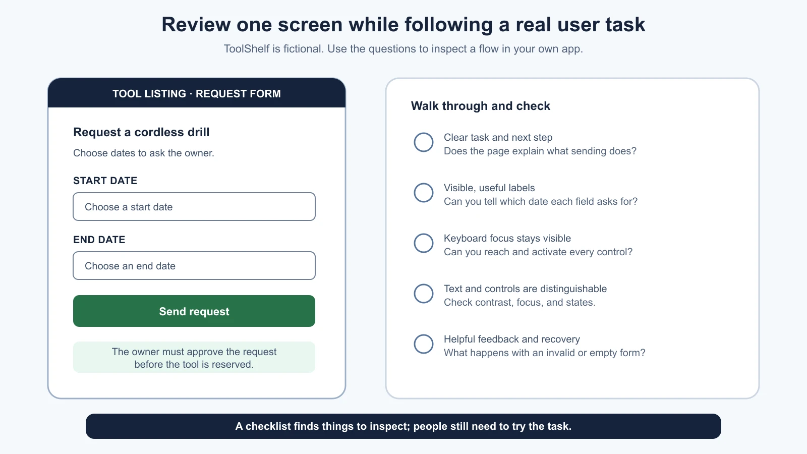
These questions do not replace testing with people. They help you catch obvious barriers and give an AI tool a specific problem to investigate. If you have observations from a usability session, use them as evidence. If you have only your own review, label it as a review, not a user finding. See testing the prototype with real people for a task-based test session.
Make the next step clear in words and layout
A page should make its purpose visible. Use a clear page heading, group related information, and put instructions where people need them. A button label should describe the action: “Send request” tells more than “Continue” when the next step is not obvious. Link text should make sense in context. Repeating “click here” for several different links gives people little information about where each one goes.
Plain wording is not about making every sentence short. It is about choosing familiar terms, defining anything specialized, and putting the important instruction before the action that depends on it. If a date must be entered in a particular format, say so beside the field before someone submits it. If sending a request does not reserve a tool, explain that before the person expects a confirmed booking.
Keep the visual order aligned with the task order. A form with a title, short instruction, labeled fields, and one clear primary action is easier to scan than a page where every box competes for attention. A long flow may need headings and progress information so people can tell where they are. Avoid adding a second navigation path or an unrelated feature during an accessibility fix unless the user need calls for it.
AI-generated interfaces often use polished visual styling while leaving the task unclear. A large colorful button cannot explain what it does if its label says “Go.” Ask the tool to improve the information or action, not just the decoration. Then check that its wording still matches the actual product rule.
Check the layout at a narrow width
Responsive layout means that content and controls adapt as the available screen width changes. A “mobile-first” review starts with a narrow screen so you notice what a person can see and do when space is limited. It does not mean every user is on a phone or that the desktop version does not matter.
Open the same task at a narrow phone-sized viewport and a wider desktop size. Check whether:
- The heading, instructions, fields, and actions remain in a sensible order.
- Text and controls fit without clipping or forcing unnecessary horizontal scrolling.
- Form labels stay close to their fields instead of drifting across the screen.
- The primary action remains easy to find without covering another control.
- Menus and dialogs can be opened, read, and closed at the narrower width.
- Zooming in does not hide focused controls behind a fixed header or footer.
WCAG 2.2's Reflow guidance describes content adapting to a width equivalent to 320 CSS pixels for most vertically scrolling content, without loss of information or functionality; content that needs two-dimensional layout, such as a data table, has exceptions. This is a useful check for a regular product form, not a guarantee that the whole experience works on every device. W3C's Reflow guidance explains the criterion and its exceptions.
Do not shrink desktop controls until they technically fit. On a phone, the label should remain readable, the tap targets should not crowd one another, and the person should not need to pan sideways to understand a simple form. Check landscape orientation and zoom when they matter to the task. A screenshot can reveal overlap, but trying the workflow reveals whether the action remains reachable.
Use color and contrast carefully
Text needs enough contrast against its background to remain readable. WCAG 2.2 AA sets a minimum contrast ratio of 4.5 to 1 for ordinary text and 3 to 1 for large text. “Large” has a specific meaning in the standard; do not use those numbers as a general score for the whole page. Non-text controls and visual indicators have their own requirements. Use a contrast checker for candidate colors, then inspect the text and controls in the actual interface. The W3C contrast guidance explains what the ratios apply to and notes exceptions.
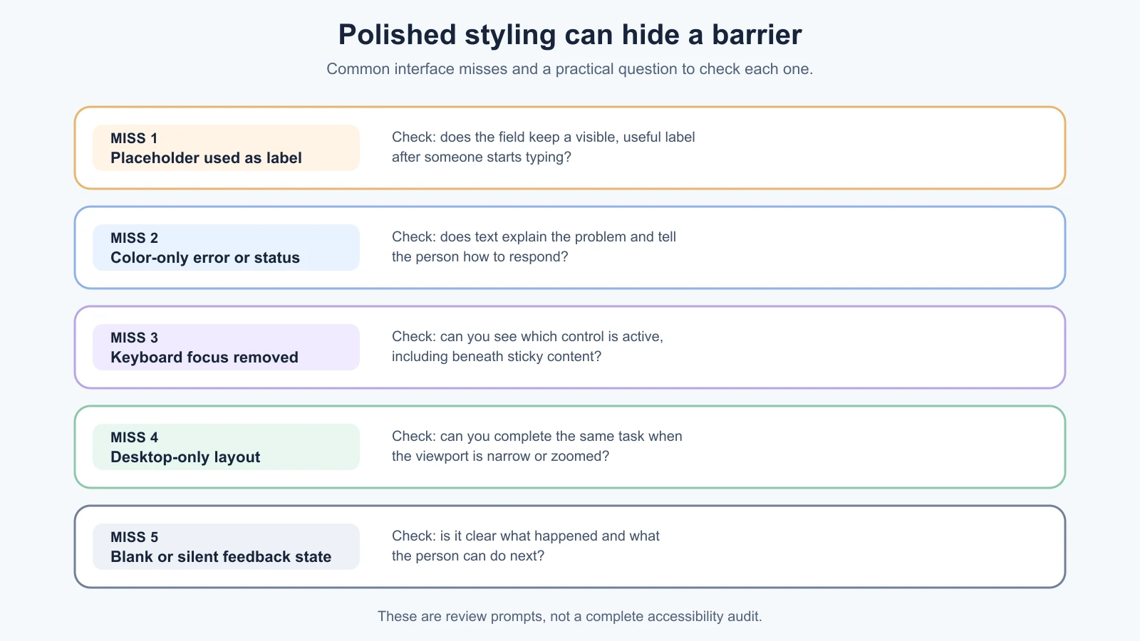
Color should not be the only way to communicate meaning. If a date is unavailable, do not show it only as a red square. Add a label or icon with a clear text alternative, and ensure the unavailable state is understandable when the colors cannot be distinguished. If a form field has an error, show a message that explains the problem and how to correct it. A red outline alone does not tell someone what to do.
Check text in its real states: default, hover, focus, disabled, error, and selected. A pale gray field label may appear readable in a mockup and disappear on a phone outdoors or at higher zoom. A focus outline may be removed by a reset style. Ask the AI to identify the foreground and background color values, then verify them with a contrast tool instead of accepting “the contrast is good” as evidence.
Navigate the task with a keyboard
Some people use a keyboard instead of a mouse. Others use a switch, voice input, or assistive technology that follows keyboard focus. Try the main task without touching the mouse:
- Reload the page and press
Tabto move forward through controls. - Check that focus moves in an order that matches the page and is always visible.
- Use
ShiftplusTabto move backward. - Activate links and buttons with their expected keys, often
EnterorSpacedepending on the control. - Open any menu or dialog, move through it, and close it without being trapped.
- Complete the task, including correcting a form error, using only the keyboard.
The exact keys for complex controls can differ, so a simple check does not establish full compliance. If focus jumps to a strange place, disappears, or gets trapped, note the specific control and step. A visible focus ring is important; do not remove it just because it looks less polished. Check that sticky headers, cookie notices, and dialogs do not cover the item that currently has focus.
Use a real button for an action and a real link for navigation. A clickable div may look right but often needs extra keyboard behavior and semantics that a native control already provides. The browser exposes a control's accessible name and role to assistive technology. If a button contains only a decorative icon, it still needs a useful name such as “Close request details.”
Give every field and message a useful name
A label identifies a form control, such as “Start date” above a date field. In HTML, the visible label should be programmatically associated with the field, usually using a <label> element. This allows browsers and assistive technology to connect the text to the control. A placeholder inside the field is not a reliable substitute: it may disappear as the person types and can be hard to distinguish from entered content. The W3C form labeling tutorial shows explicit and implicit label associations and explains that labels help identify controls.
Check that:
- Every input has a visible label or an appropriate accessible name.
- The label describes the information requested, not just the data type.
- Instructions such as a date format are available before the person needs them.
- A required field is identified in text, not by color or an unexplained asterisk alone.
- Error text names the field and explains a possible correction.
- Success or loading feedback is noticeable and associated with the action that caused it.
A field called “Date” could mean pickup date, return date, or date of birth. A clearer label removes guesswork. If the app provides an error summary at the top, make sure a person can find the problem field and understand which message belongs to it. If the form preserves values after an error, people do not have to enter them again unnecessarily.
Screen readers interpret page structure and control names. You can do a first review by looking at headings and labels in the browser's accessibility-related panels or by using an installed screen reader if you know how. However, screen readers differ, and a quick inspection is not a substitute for testing with people who use assistive technology. Do not add ARIA attributes as decoration. Ask why a native HTML element does not already provide the needed name, role, or state.
Design the empty, loading, success, and error states
The empty state is what a page shows before a person has added or received any records. Instead of a blank panel, tell them what belongs there and how to begin. For ToolShelf, a request list might say, “No requests yet. Browse tools to ask an owner about borrowing one.”
A loading state tells people that an action is in progress when it takes long enough to notice. A success state confirms what just happened and what comes next. An error state explains what failed and, when possible, how to recover. These messages matter to screen reader users too: a visible change that is never announced may go unnoticed. For a save action, distinguish “Request sent” from “Request approved” if those have different meanings.
Try the main flow with realistic edge cases, not only ideal input:
- No results match a search.
- A required field is missing.
- A date range is invalid or unavailable.
- A save takes time or fails.
- The person has no permission to edit a record.
- A long tool name or translated label wraps to multiple lines.
Check that the message appears near the relevant control or in an obvious summary, does not rely on color alone, and does not erase valid information unnecessarily. If the task fails, tell people whether to retry, correct a value, or contact someone. Do not promise recovery that the app does not actually provide.
Run an automated browser check, then do the human checks
Chrome DevTools includes Lighthouse, an automated tool that can report on accessibility along with other page qualities. To run a basic report in Chrome desktop, open the page, open DevTools, select the Lighthouse panel, enable the Accessibility category, and run the audit. Review each finding and its explanation. The panel's labels can change with Chrome versions, so use current Chrome Lighthouse documentation if the controls differ.
Run the report on a page that requires sign-in if the issue appears there, and repeat it on the important states you can reach. A report for the home page says little about a form or dialog the tool did not inspect. Fix one finding, reload, and check the affected state again. If Lighthouse flags something you do not understand, ask the coding tool to point to the element and relevant source before it edits anything.
Automated audits can catch some issues, such as missing accessible names or certain contrast problems. They cannot decide whether the flow makes sense, whether focus order is usable, whether a custom control behaves well with a screen reader, or whether the error message helps a person recover. Chrome's accessibility documentation distinguishes automated markup checks from keyboard and screen reader use, and MDN also warns that automated tools cannot find every accessibility problem. A high Lighthouse score is a clue about the checks it ran, not a certification or proof of conformance.
Use this small review sequence:
- Run Lighthouse on the target page and note its findings.
- Check the main task at a narrow and wide width.
- Complete it with a keyboard and watch the focus indicator.
- Check labels, instructions, and error recovery.
- Review contrast and states, including empty, loading, and success.
- Ask someone with relevant access needs to try the workflow when possible, and include people with disabilities in planned user research.
For applicable legal or contractual accessibility requirements, confirm the current standard and get qualified advice. This lesson is a practical first review, not a formal conformance evaluation.
Ask an AI tool to inspect a specific barrier
Do not ask the AI to “make this accessible” and accept a broad redesign. Name the page, task, environment, and concern, then ask it to inspect and propose before editing:
1Review the ToolShelf request form for this task: find a tool, choose dates, and send a request.
2
3Inspect the current page and source. Report:
4- Whether each control has a useful visible label and accessible name.
5- What happens when I use the task with only a keyboard.
6- Whether focus stays visible and follows a sensible order.
7- What a person sees for empty, loading, success, and error states.
8- Whether the layout remains usable at a narrow width and at zoom.
9- Which text or controls may need a contrast check.
10
11For each finding, cite the element or source file and separate what you verified from what needs a human check. Suggest the smallest change. Do not edit files, add ARIA attributes, or change product behavior yet.
If the tool cannot open a browser or use a keyboard, it must say so instead of claiming it tested the interface. You can provide a screenshot for visual feedback, but screenshots do not reveal keyboard behavior or how a screen reader announces a control. Verify the proposed change yourself and repeat the relevant checks.
Further reading
We checked these links on 4 November 2026. Standards and browser tools are updated over time, so confirm the details in the current version.
- WCAG 2.2 Understanding documents, W3C, including Contrast Minimum and Reflow.
- W3C Forms Tutorial: Labeling Controls and User Notifications, for labels, instructions, and validation feedback.
- Chrome Lighthouse overview, for the current browser-based audit workflow.
- Easy Checks: A First Review of Web Accessibility, W3C, for a manual preliminary review.
- Design and polish, for focused screenshot feedback and visual refinement.
Mistakes beginners make
- Reviewing only the desktop happy path. Check the same task at a narrow width and with missing, invalid, or empty data.
- Treating a pretty interface as a clear one. Check the wording, order, and next action rather than judging color and spacing alone.
- Using color as the only signal. Add text or another useful indication for errors, selected values, and availability.
- Using a placeholder instead of a field label. Keep the purpose of a control visible while someone fills it in.
- Removing focus styles to tidy the design. Keyboard users need to see which control is active.
- Trusting an automated score as proof. Run a report, then check the workflow manually and with relevant users.
- Adding ARIA without understanding the control. Prefer native elements and verify names, roles, and states.
- Letting the AI redesign the whole page for one barrier. Name one task and ask for the smallest change that resolves it.
Recap and try it yourself
Choose an important user task and check whether its instructions, layout, field labels, keyboard path, contrast, and feedback make the next step clear. Review empty, loading, success, and error states. Use Chrome Lighthouse to find some automated issues, then do the human checks it cannot perform. Keep accessibility in the product work from the start, and ask people with relevant access needs to test the experience when possible.
Try it: open a practice app in Chrome and run Lighthouse with Accessibility enabled. Pick one finding and check the element it identifies. Then complete one core task at a narrow viewport using only the keyboard. Write down what happened, which user need the issue could affect, and the smallest change you would ask the AI to make. Do not describe the product as accessible based on one report.