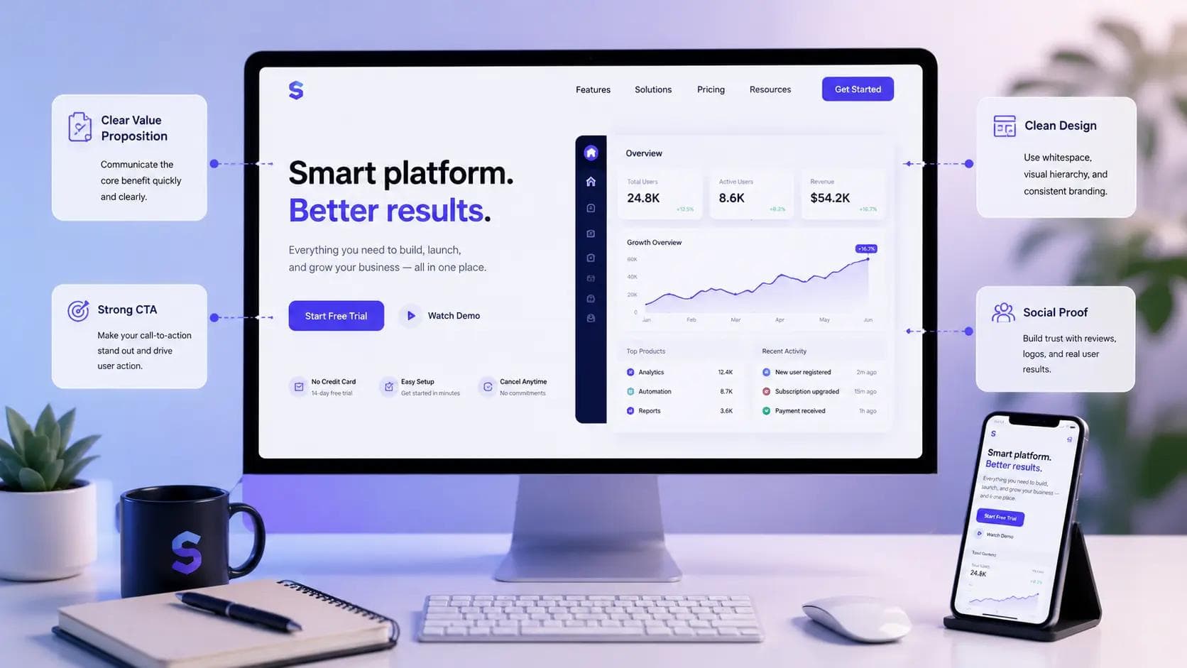
I once spent three weeks polishing a SaaS landing page — perfect gradients, a slick animated hero, copy I was genuinely proud of. It converted at 0.9%. Then I stripped out half the design flourishes, rewrote the headline in plain English, and moved the pricing link higher up the page. Conversions jumped to 3.4% within two weeks. That gap between "looks good" and "actually works" is the whole story behind every SaaS landing page that struggles to convert. This guide walks through what I've learned building and rebuilding these pages, so you can skip the expensive lessons and get to the results faster.
You'll get a practical breakdown of the sections that matter, the copywriting choices that move the needle, and the mistakes that quietly kill sign-ups. No theory for theory's sake — just what's worked, what hasn't, and why.
Start With the Problem, Not the Product
Most SaaS landing pages open by describing the software. That's backwards. Visitors don't care what your product is until they know it solves something they're dealing with right now.
Your hero section — the part visible without scrolling, often called "above the fold" — needs to name the visitor's problem before it names your solution. A headline like "Project management software for teams" tells people what you built. A headline like "Stop losing track of who owns what" tells people why they should care.
In my experience, the strongest hero sections follow a simple pattern: a headline that states the outcome, a subheadline that explains how you get there, and a single call-to-action button that's impossible to miss. Skip the second CTA competing for attention up top — split focus is one of the fastest ways to tank a conversion rate.
A quick example. When I rewrote a hero section for a small analytics tool from "Powerful analytics for modern teams" to "See exactly which features your users actually use," sign-ups from that page alone rose by roughly 40% over a month, with no other changes made. The product didn't change. The clarity did.
One thing worth avoiding here: don't try to explain your entire feature set in the hero. That's what the rest of the page is for.
Build Trust Before You Ask for Anything
People don't sign up for software from a company they've never heard of just because the design looks clean. They need reasons to believe you're legitimate, and those reasons have to show up early.
Social Proof That Actually Works
Logos of companies using your product help, but only if they're recognizable or relevant to your visitor's industry. A wall of unfamiliar logos does very little. Customer quotes work better when they're specific — "This cut our onboarding time from two weeks to three days" beats "Great tool, highly recommend."
Numbers People Can Verify
According to a 2023 survey by Nielsen Norman Group on trust signals in web design, users consistently rated pages with specific, checkable claims as more credible than those with vague superlatives. If you can say "12,000 teams" instead of "thousands of teams," say the specific number.
Security and Compliance Cues
For B2B SaaS especially, a small line mentioning SOC 2 compliance, GDPR readiness, or uptime guarantees can matter more than you'd expect, particularly for enterprise buyers evaluating multiple tools at once.
Trust signals work best when they're placed near the decision points on the page — right by your CTA buttons, not buried in a footer nobody scrolls to.
Write Copy for Skimmers, Not Readers
Almost nobody reads a SaaS landing page top to bottom on a first visit. They scan headlines, glance at bold words, and look for anything that confirms they're in the right place. Your copy has to work for that behavior, not against it.
Here's the structure I use for most feature sections:
- Lead with the benefit, not the feature name. "Never miss a deadline again" instead of "Automated reminders."
- Follow with one supporting sentence that explains how the feature delivers that benefit.
- Keep paragraphs short. Three or four lines, maximum. Long blocks of text get skipped entirely.
- Use subheadings that could stand alone. Someone should understand your page's structure just by reading the H2s and H3s.
A common mistake I see on early-stage SaaS pages is copy written by the founding team that reads like internal documentation — packed with jargon that makes sense to the people who built the product but means nothing to a first-time visitor. If you have to explain a term, explain it in the sentence, not in a tooltip nobody clicks.
Your value proposition — the single sentence that answers "why this tool, why now" — should be repeatable by someone after a five-second glance at the page. If it takes a paragraph to explain, it's not a value proposition yet, it's a draft.
Design the Call-to-Action Like It's the Only Thing That Matters
Your <CTA> button is doing more work than any other element on the page, and it gets less attention than the hero image nine times out of ten. That's backwards.
A few things that consistently move conversion rate in the right direction:
- Button copy that describes the action, not a generic "Submit" or "Get Started." "Start your free trial" or "See your first report in 5 minutes" gives people a clear expectation.
- Contrast that makes the button impossible to miss, even for someone glancing at the page on a phone.
- Repeated CTAs at natural stopping points — after the hero, after the feature section, after pricing — rather than one lonely button at the very top.
- Removing friction from the first click. If your form asks for a credit card before a free trial, expect a meaningfully lower conversion rate than tools that don't.
I made this mistake early on with a client's page: we buried the free trial link inside the navigation menu and put a "Book a demo" button as the only visible CTA. Demo requests take more commitment than trial sign-ups, and our numbers reflected that — conversions were nearly half what a comparable competitor page was reporting. Once we added a visible trial CTA alongside the demo option, overall conversions recovered within a week.
Don't Ignore Page Speed and Mobile Behavior
This is the part founders skip because it's less visually satisfying than copy or design, but it has an outsized effect on conversion rate. Research from Google's own Core Web Vitals data has repeatedly shown that as page load time increases past a few seconds, bounce rate climbs sharply — visitors simply leave before they see your offer.
A few practical steps that make a real difference:
- Compress hero images and avoid autoplaying video unless it's essential to explaining the product.
- Load third-party scripts (chat widgets, analytics, tracking pixels) asynchronously so they don't block the page from rendering.
- Test the mobile version separately from desktop. A layout that looks great on a 27-inch monitor can bury your CTA below three scrolls on a phone.
In my experience, mobile traffic on SaaS landing pages is often underestimated, especially for tools marketed through social channels or newsletters. If your mobile conversion rate is meaningfully lower than desktop, that's usually a design problem, not a targeting problem.
Test Before You Trust Your Instincts
Every opinion in this article, including mine, is a starting point — not a rule. What works for a project management tool won't necessarily work for a developer API product or a finance dashboard. That's what A/B testing is for.
Start small. Test one variable at a time — headline, CTA copy, or hero image — rather than redesigning the whole page and hoping something sticks. Tools like Google Optimize alternatives such as VWO or Convert let you run structured tests without needing an engineering team involved for every change.
A few tools worth knowing for this stage:
- Hotjar — heatmaps and session recordings that show you where visitors actually click and where they drop off. Genuinely useful for spotting confusing sections you'd never catch by staring at the page yourself.
- Unbounce — a landing page builder aimed specifically at marketers who want to test variants without waiting on developers. Solid for smaller teams without in-house design resources.
- PostHog — combines product analytics with experimentation, useful if you want landing page testing and in-app behavior data in one place.
None of these tools fix bad copy or a confusing value proposition on their own. They just tell you, faster, what isn't working — which is still valuable.
Key Takeaways
- Lead with the visitor's problem, not your product description, in the hero section.
- Trust signals — specific numbers, real quotes, compliance badges — work best placed near your CTA buttons.
- Write for skimmers: short paragraphs, benefit-led subheadings, plain language over jargon.
- Treat your call-to-action as a primary design element, not an afterthought.
- Page speed and mobile layout directly affect bounce rate and conversion rate.
- Test one variable at a time instead of overhauling the entire page based on a hunch.
Frequently Asked Questions
What makes a SaaS landing page different from a regular landing page? A SaaS landing page usually has to explain an intangible product, often with a recurring pricing model and a free trial or demo path. That means it needs to work harder to build trust and clarify value quickly, since visitors can't physically see or hold what they're buying before committing.
How long should a SaaS landing page be? There's no fixed length. Simple, well-known products can convert with a short page — hero, a few benefits, pricing, CTA. Complex or unfamiliar products often need more explanation, social proof, and FAQ content to answer objections before a visitor leaves.
Should I show pricing directly on the landing page? In most cases, yes. Hiding pricing behind a "Contact us" form adds friction and can signal that your product is more expensive or complicated than it actually is, unless you're specifically targeting large enterprise deals where custom pricing is expected.
Can one landing page work for multiple audiences? It's possible but usually weaker than dedicated pages. If you sell to both small teams and enterprise buyers, their concerns differ enough that a single generic page tends to under-serve both. Separate pages with tailored messaging typically convert better.
Why is my SaaS landing page getting traffic but no sign-ups? This usually points to a mismatch between what brought the visitor to the page and what the page delivers, unclear value proposition, too much friction in the sign-up flow, or missing trust signals. Checking session recordings is often faster than guessing.
Does design matter more than copy for a SaaS landing page? Not in my experience. Clean design helps people trust and read your page, but copy is what actually persuades them. A beautifully designed page with vague, jargon-heavy copy will usually underperform a plainer page that clearly explains the problem it solves.
Conclusion
Getting a SaaS landing page to convert isn't about chasing trends in design or cramming in every feature you've built. It comes down to a handful of decisions done well: a hero that speaks to a real problem, trust signals placed where people actually look, copy built for scanning, and a call-to-action that's genuinely easy to act on. None of this requires a full redesign to start improving. Pick the section of your page that feels weakest right now — probably the hero headline or the CTA copy — and rewrite just that one piece today. Small, deliberate changes to a SaaS landing page tend to compound faster than most founders expect.
About the Author

Madhu - WriterDock
Madhu is a writer and SEO Executive who is passionate about creating informative, engaging, and search-optimized content that helps readers find practical solutions. With expertise in content strategy and SEO, she transforms complex topics into easy-to-understand, valuable blog posts. She loves sharing knowledge through helpful blogs that educate, inspire, and empower audiences.