If you looked at a website in 2024, you saw a lot of boxes. Apple did it. Microsoft did it. Suddenly, every portfolio and SaaS landing page looked like a Japanese lunch box. The Bento Grid had taken over.
But the web moves fast. As we settle into 2026, the rigid, static boxes of yesteryear are breaking open. Users are tired of "flat" designs that feel like spreadsheets. They want depth, movement, and humanity. They want interfaces that feel like living environments, not just digital brochures.
This year isn’t just about making things look pretty; it’s about making them feel intuitive. We are seeing a shift away from sterile perfection toward "Soft Brutalism" and eco-conscious coding.
If you are a designer, developer, or business owner looking to keep your digital presence relevant, you need to know what’s coming next. Here are the 7 UI trends dominating web design in 2026.
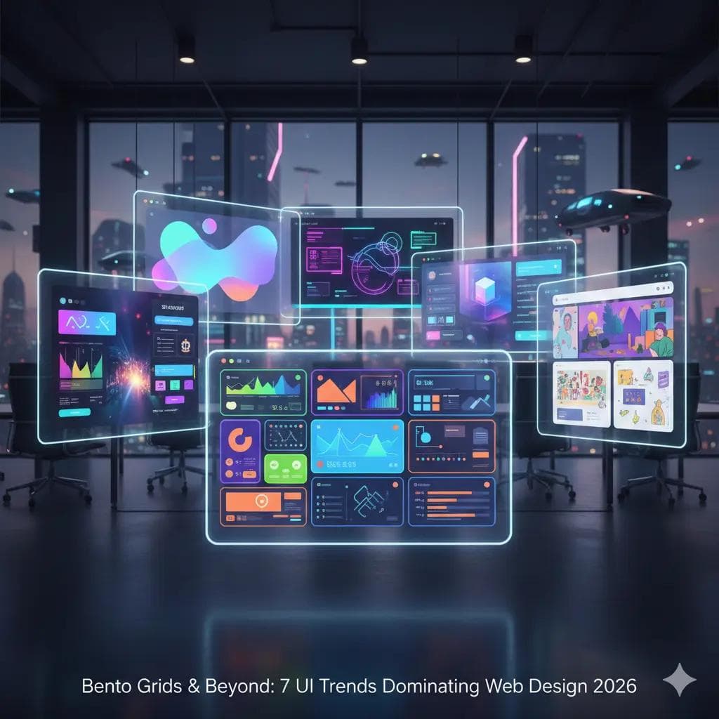
1. Bento Grids 2.0: The "Active" Grid
The Bento Grid isn't dead—it just woke up.
In 2024, Bento grids were mostly static images and text arranged in rectangles. It was clean, but passive. In 2026, we are seeing the rise of the Active Grid.
Designers are realizing that a box doesn’t have to be a cage. These new grids are highly interactive. When you hover over a tile, it doesn’t just change color; it expands, plays a video, or reveals a secondary layer of data.
What’s New?
- Video Tiles: Instead of static icons, grid blocks now house looping, lightweight videos that tell a story instantly.
- Variable Aspect Ratios: We are moving away from the perfect square. "Tall cards" (vertical rectangles) are being used for mobile-first storytelling, breaking the monotony of the standard grid.
- Drag-and-Drop Personalization: Websites are letting users rearrange the grid themselves, similar to how you move widgets on an iPhone home screen.
Pro Tip: Don't use a Bento grid just to be trendy. Use it when you have diverse content (e.g., a portfolio with video, text, and stats) that needs to be consumed in "bite-sized" chunks.
2. Spatial UI and "Atmospheric" Depth
Flat design had a long reign, but the era of the "Spatial Web" is here. Influenced by the rise of AR (Augmented Reality) and headsets like the Apple Vision Pro, web designers are bringing depth back to the browser.
This isn't the tacky 3D of the late 90s. This is sophisticated Atmospheric Depth. Think of your website as a physical space with lighting, shadows, and layers. Elements don't just sit on the screen; they float above it.
How to Spot It:
- Glassmorphism Evolved: The "frosted glass" look is now being paired with dynamic background blurs that shift as you scroll.
- Parallax 3.0: Elements move at different speeds, but with realistic physics. Backgrounds drift slowly while foreground elements snap into place, creating a sense of immersion.
- Soft Shadows: Instead of harsh black drop shadows, designers are using colored, diffused shadows that make buttons feel like they are glowing.
3. Kinetic Typography: Text as the Hero
For years, images did the heavy lifting. In 2026, typography is taking center stage. But this text doesn't sit still.
Kinetic Typography means moving text. We aren't talking about a basic "fade-in" effect. We are talking about headlines that stretch, twist, and react to the user’s cursor.
With internet speeds faster than ever, loading custom, variable fonts is seamless. This allows designers to use text as the primary visual element, reducing the need for heavy stock photos.
Why It Works:
- Immediate Attention: Movement grabs the eye. A headline that slowly uncoils as you read it is impossible to ignore.
- Brand Personality: A font that "bounces" feels playful. A font that "glides" feels luxurious. You can convey the mood of your brand without a single image.
4. Scrollytelling: The Narrative Web
The "infinite scroll" of social media has trained our brains to keep moving down. Web designers are hacking this behavior with Scrollytelling.
Scrollytelling transforms a long web page into a linear story. As you scroll, the background doesn't just move up—it changes. An animation might play, a product might rotate 360 degrees, or a chart might draw itself.
The Shift from "Click" to "Scroll"
Users are clicking less. Clicking requires a decision ("Do I want to go to this new page?"). Scrolling is passive and continuous. By putting your entire product story on one immersive, scrolling page, you keep the user in the "flow state" longer, which drastically increases conversion rates.
Key Takeaway: If your product requires explanation (like complex software or a luxury item), use scrollytelling to guide the user step-by-step through the value proposition.
5. Soft Brutalism: The "Anti-Tech" Aesthetic
Tech fatigue is real. People are tired of websites that look like generic startup templates. This has given birth to Soft Brutalism.
Traditional Brutalism (popular around 2022) was harsh, ugly, and confusing. Soft Brutalism takes the "raw" vibe of that trend but makes it usable. It uses bold borders, high-contrast colors, and unpolished layouts, but pairs them with friendly fonts and plenty of whitespace.
Characteristics:
- Visible Grids: You can see the lines separating the sections, almost like an old newspaper or blueprint.
- Neo-Grotesque Fonts: Big, bold, plain fonts that are easy to read.
- Pastel Palettes: Instead of aggressive neon, Soft Brutalism often uses muted pastels (sage green, soft yellow) to make the "harsh" layout feel welcoming.
6. Micro-Delight: The Return of Whimsy
In the quest for efficiency, many websites lost their soul. In 2026, designers are bringing back joy through Micro-Delights.
These are tiny, non-essential animations that trigger when a user interacts with an element. It’s the confetti that pops when you finish a task. It’s the way a "Like" button heart pulses before it fills in. It’s a "Contact" button that turns into an envelope when you hover over it.
Why Small Details Matter
These interactions don't change the function of the site, but they change the feeling. They provide tactile feedback that tells the user, "Yes, the system is working, and we care about your experience." In a crowded market, these moments of delight are what make a brand memorable.
7. Green UX and Sustainable Design
This is perhaps the most significant shift of the decade. Sustainability is no longer just a buzzword; it’s a design constraint.
The internet consumes a massive amount of electricity. Heavy images, auto-playing videos, and bloated code all contribute to a website’s carbon footprint. Green UX is the practice of designing low-energy, high-efficiency websites.
What Does Low-Carbon Design Look Like?
- Dark Mode by Default: On OLED screens, dark pixels turn off, saving battery and energy. Dark mode is now often the standard, with "Light Mode" as the toggle.
- Vector Over Raster: Designers are using SVG graphics (code-based) instead of heavy JPEGs or PNGs. They load instantly and look sharp at any size.
- System Fonts: Instead of forcing the browser to download a 5MB custom font file, designers are cleverly using the user's default system fonts (like San Francisco on Mac or Segoe on Windows) to create clean, ultra-fast interfaces.
FAQ: Navigating 2026 Design Trends
Q: Do I need to redesign my website every year to follow trends? A: Absolutely not. Good design lasts. However, you should audit your site every 18-24 months. If your site looks like a template from 2018, you risk looking outdated and untrustworthy.
Q: Is "Bento Grid" just a fad? A: No. It is based on modular design principles, which have been around for decades. It is highly functional for mobile devices because the blocks stack easily. The style may change, but the structure is here to stay.
Q: Will "Scrollytelling" slow down my website? A: It can if you aren't careful. The key is to lazy-load assets (load them only when they appear on screen) and use lightweight code libraries. A heavy site that takes 10 seconds to load will lose users before the story even starts.
Q: What is the safest trend to adopt for a corporate business? A: Bento Grids and Micro-Delights. They add professionalism and polish without feeling too "experimental" or risky for a serious brand.
Conclusion: Design for Humans, Not Trends
The overarching theme of 2026 is Humanity.
Whether it’s the "hand-made" feel of Soft Brutalism, the storytelling power of Kinetic Type, or the eco-consciousness of Green UX, the goal is to connect with the person behind the screen.
Don't try to cram all seven of these trends into one website. That is a recipe for chaos. Pick one or two that align with your brand's voice. If you are a playful creative agency, go for Kinetic Type and Micro-Delight. If you are a SaaS platform, lean into Bento Grids and Dark Mode.
The best UI isn't the one that wins awards; it's the one that makes the user forget they are using a computer at all.
About the Author
Suraj - Writer Dock
Suraj Kumar is a writer, entrepreneur, and the CEO and founder of this website, sharing simple and practical insights on business, creativity, and personal growth. With experience building digital projects, they enjoy helping others learn, grow, and succeed online.